UX/UI — Case Study
Wander
Wander
Hub
A collaborative app that simplifies group travel planning — itinerary management, expense splitting, and shared decisions, all in one place."
A collaborative app that simplifies group travel planning — itinerary management, expense splitting, and shared decisions, all in one place."


"Group travel needs clarity in collective decisions. Collaboration is the key — centralizing information dramatically improves the experience."
Key insight from user research

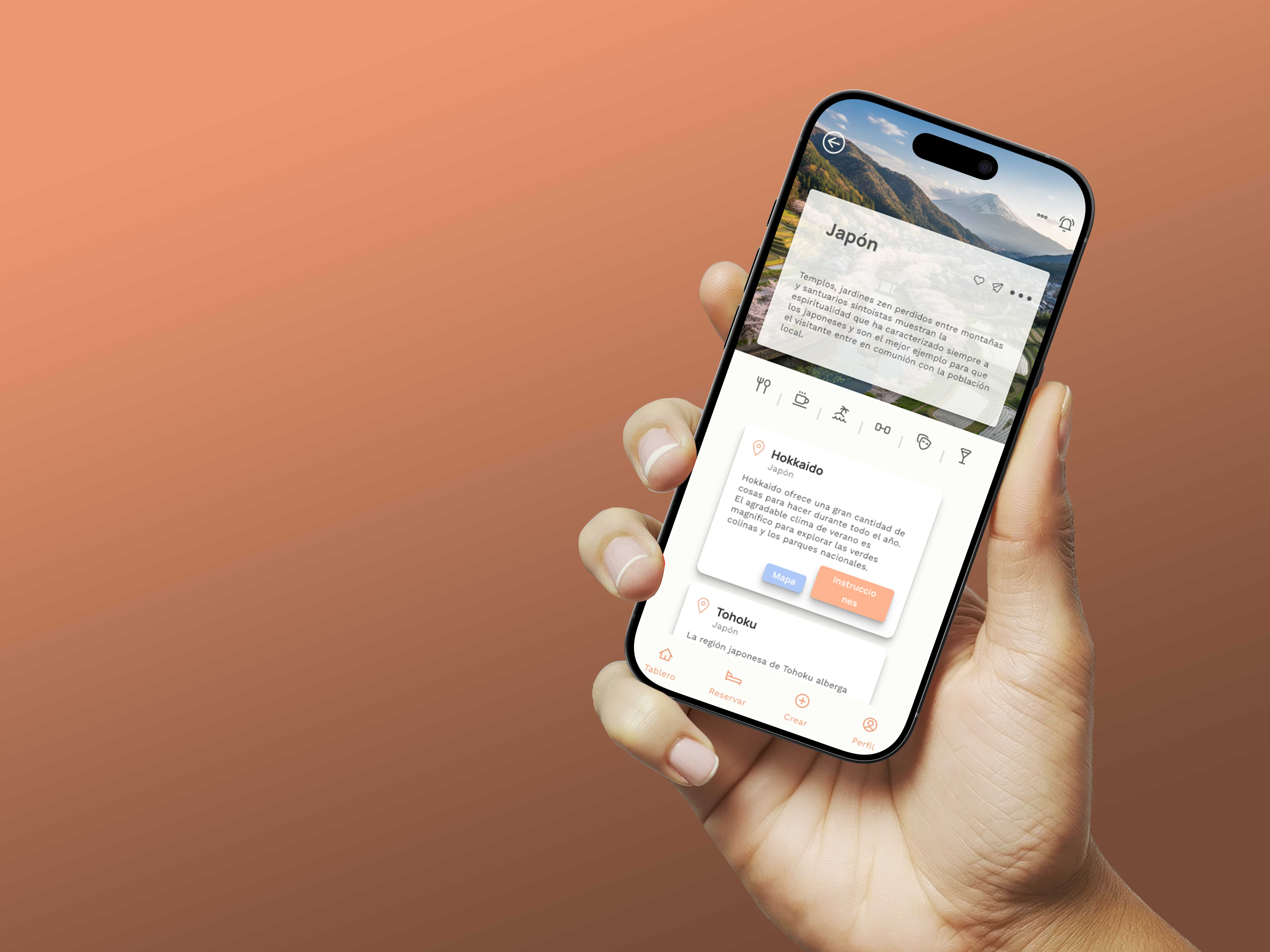
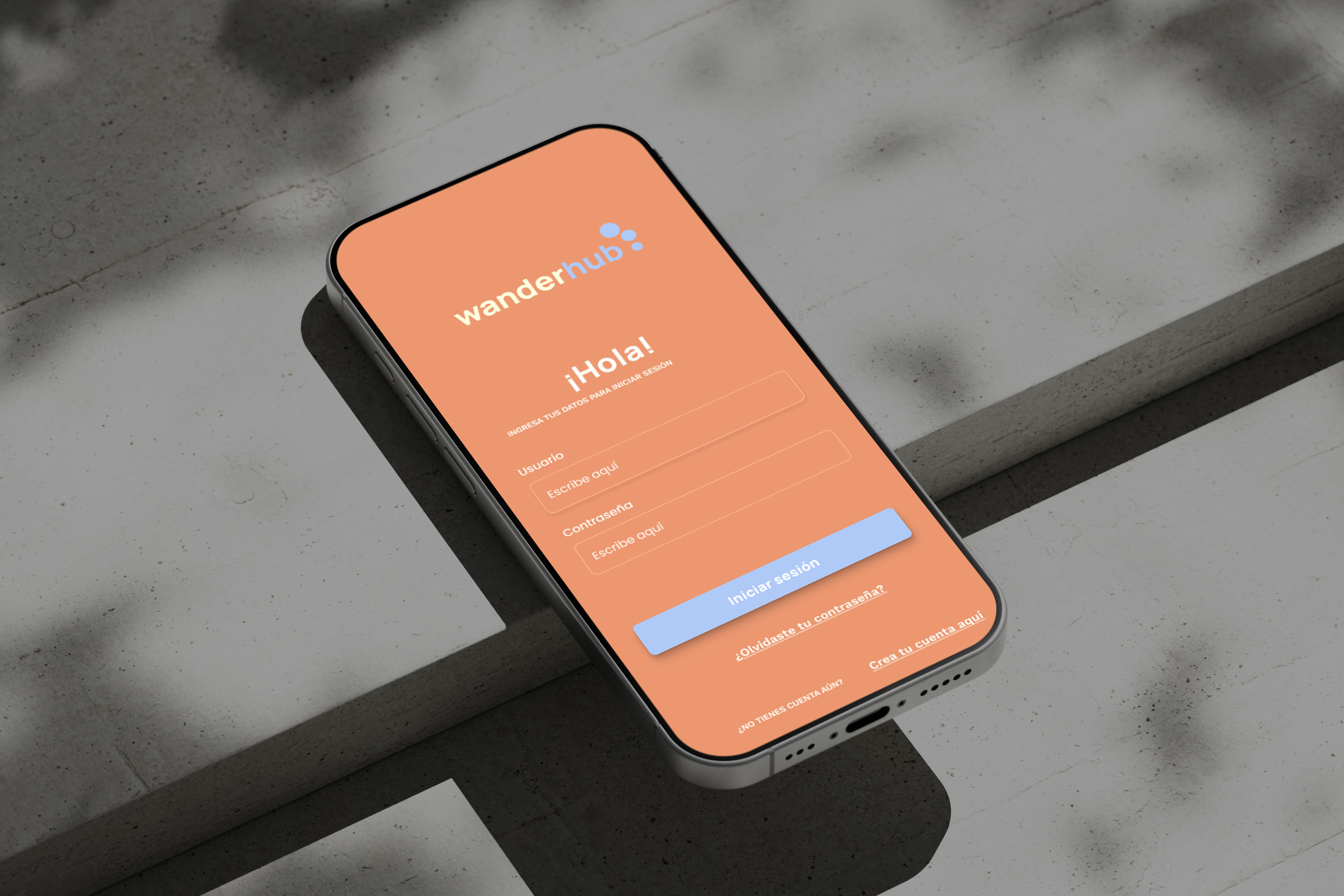
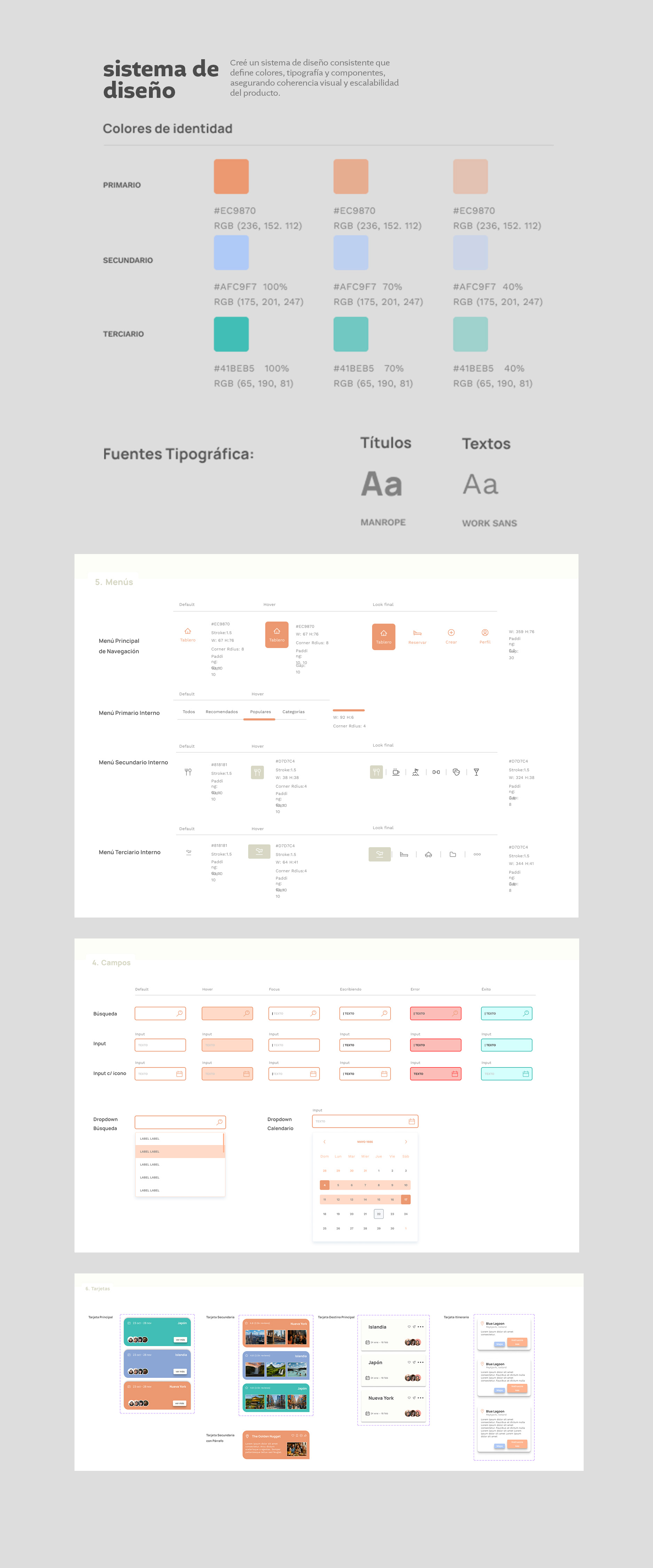
A warm, approachable system built around the energy of travel — terracotta and teal as primary palette, with Manrope for headlines and Work Sans for body text.
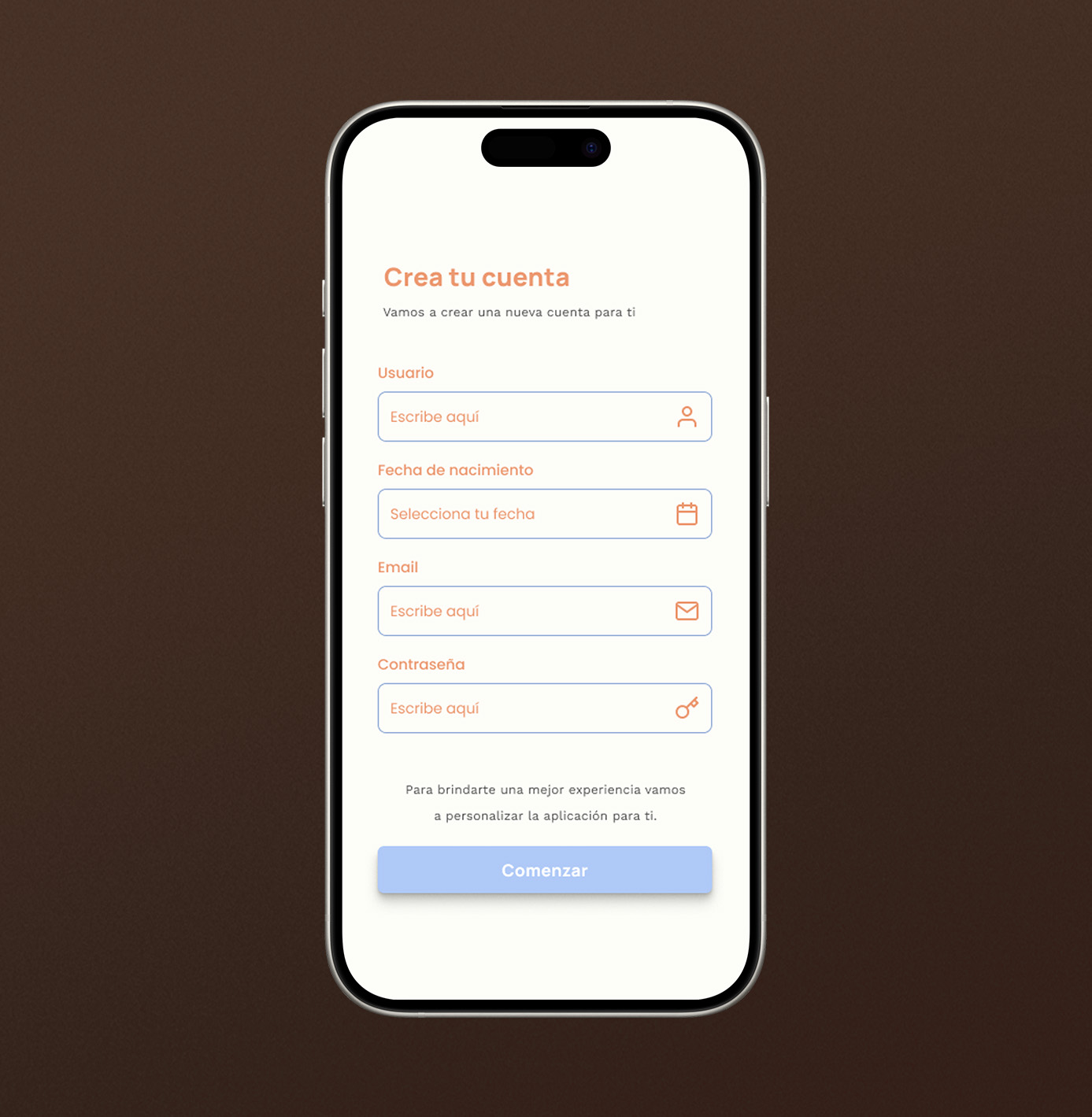

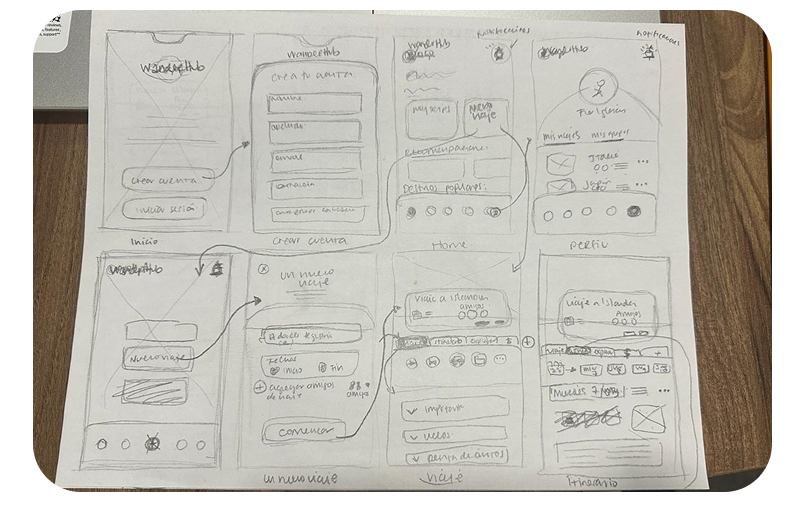
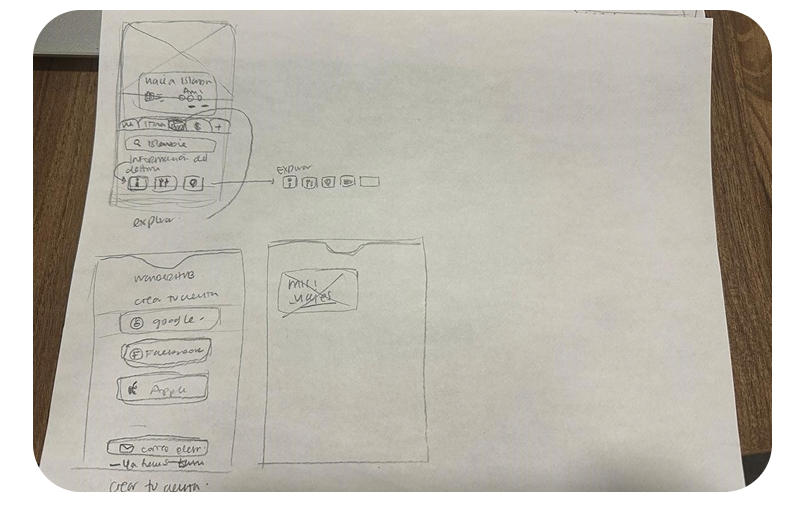
Moderated usability tests were conducted through Userberry on the high-fidelity Figma prototype. Three tasks were evaluated with 6 participants representing the profiles defined in the User Personas.
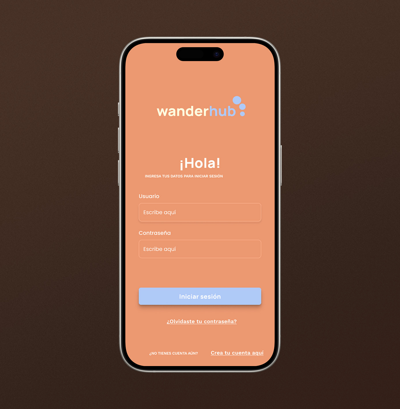
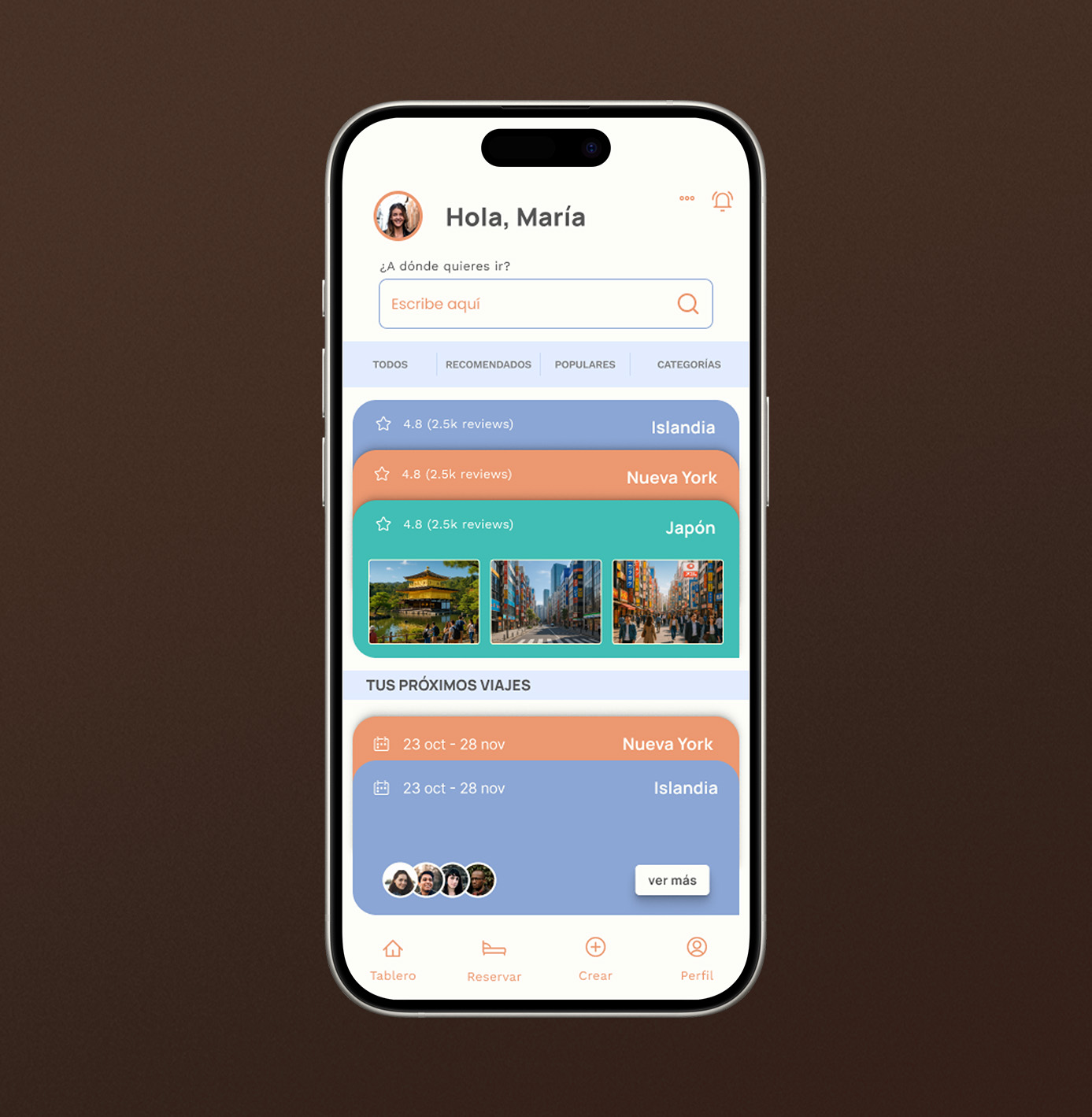
This task was easy to complete. 100% of users reached the correct screen without errors in an average time of 25.8 seconds, indicating that the login flow is clear and intuitive.
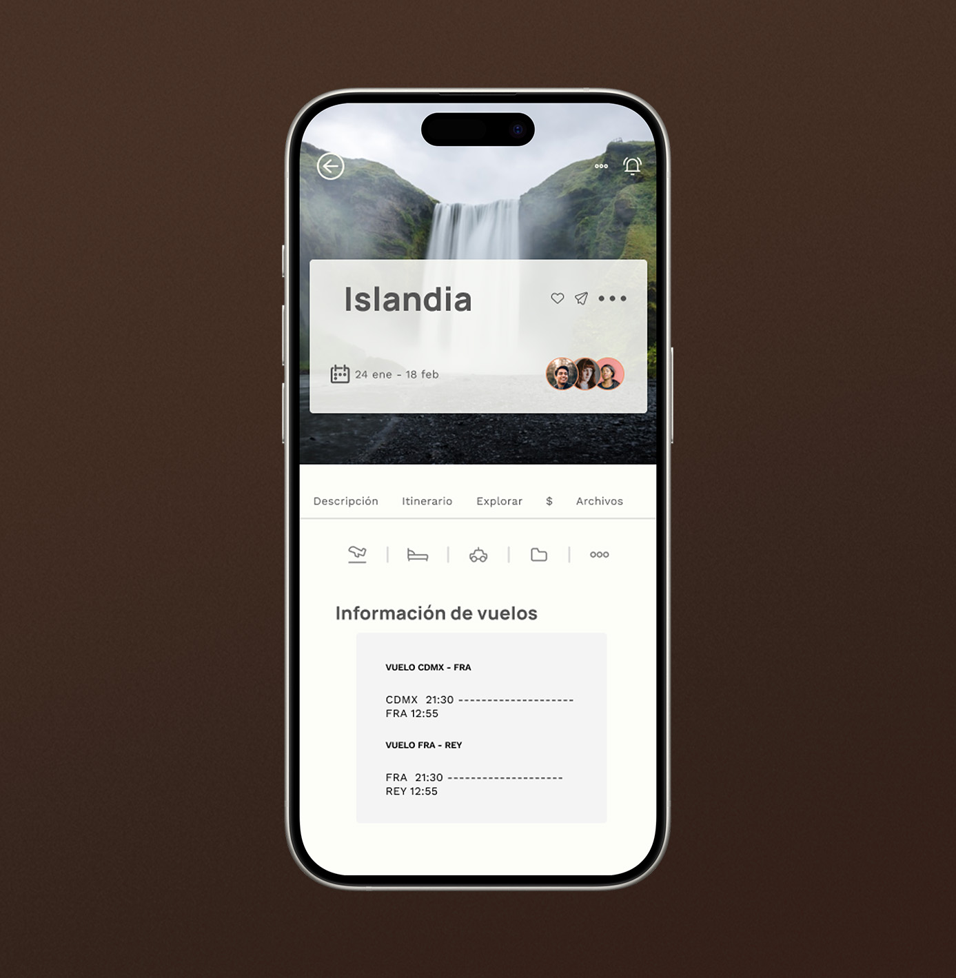
This task exposed the prototype's main navigation issue. Only 2 out of 6 users completed it. Time on screen was higher because users had to perform multiple steps. Feedback indicated confusion finding the 'Upcoming Trips' section and the back button, which points to a clear opportunity to improve the dashboard hierarchy.
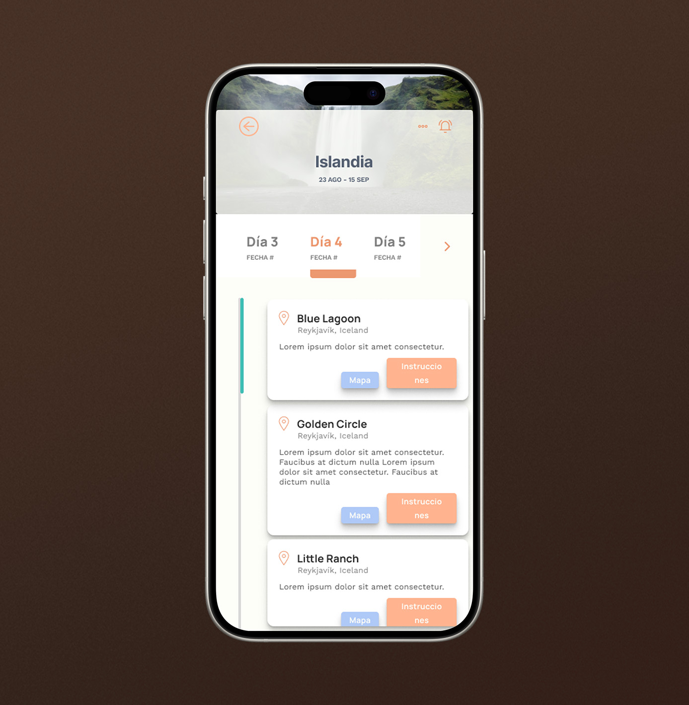
Only 2 of the 3 users who reached this task completed it, as it depended on Task 2 results. Those who did not complete it reported frustration finding menus and buttons. It was also noted that when the keyboard did not behave as expected in the prototype, some users abandoned the session.
This project reinforced the value of a thorough research phase before jumping into design decisions. User personas and journey maps revealed pain points that weren't obvious from the brief alone.