UX/UI — Case Study

Nes
Mood

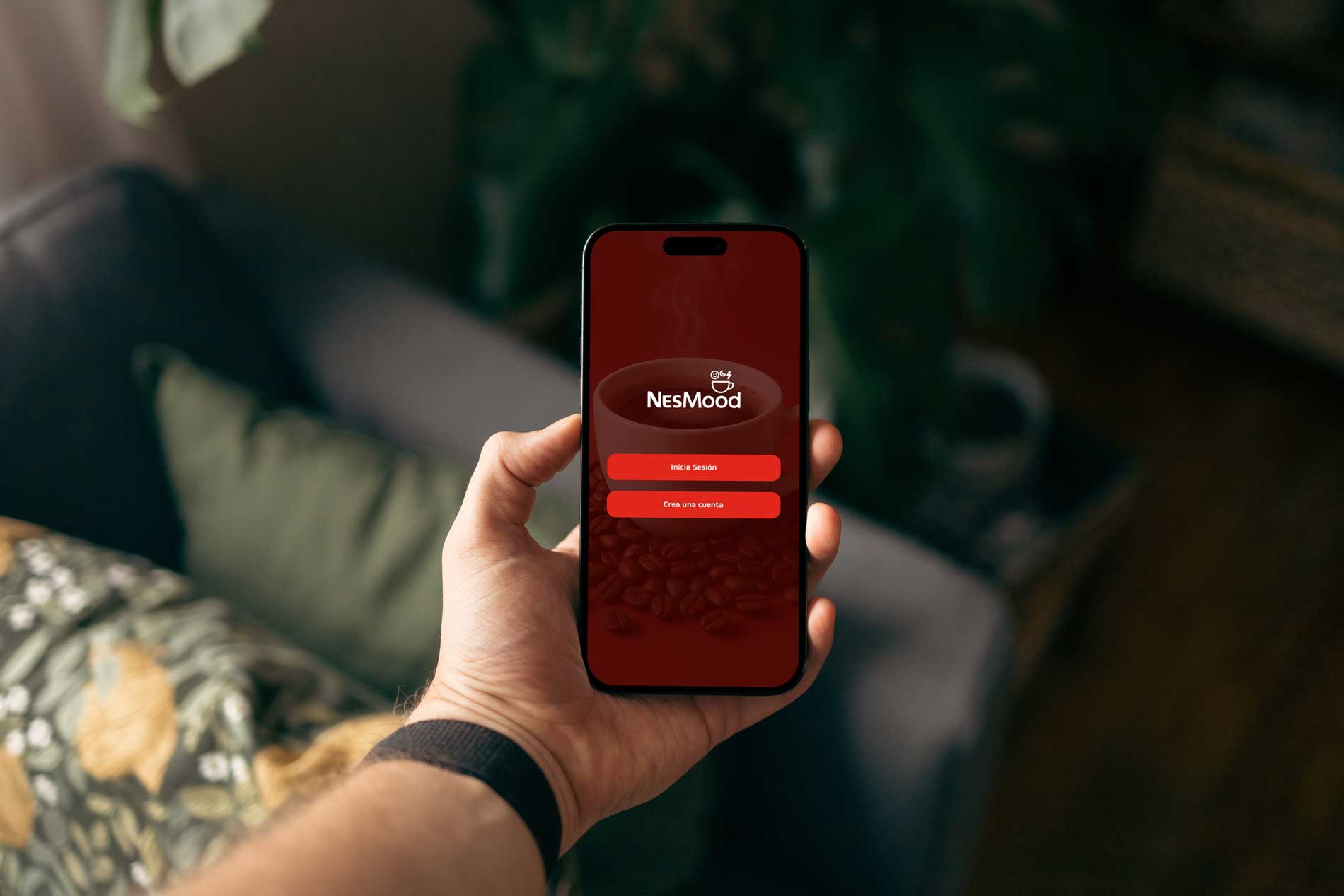
A concept app that transforms coffee into an interactive, mood-driven experience. Recipes, challenges and community — all in one place.

Role
UX/UI Designer
Year
2025
Tools
Figma · Maze
Type
Concept Project for EBAC Latam — UX/UI Certification
Read full case study on Notion
NesMood — App mockup
01
Research
User surveys, interviews & benchmark analysis
02
Define
User personas, journey maps & pain points
03
Ideate
Information architecture, wireframes & Moscow method
04
Prototype
Design system, hi-fi screens & usability testing
01

What is NesMood?

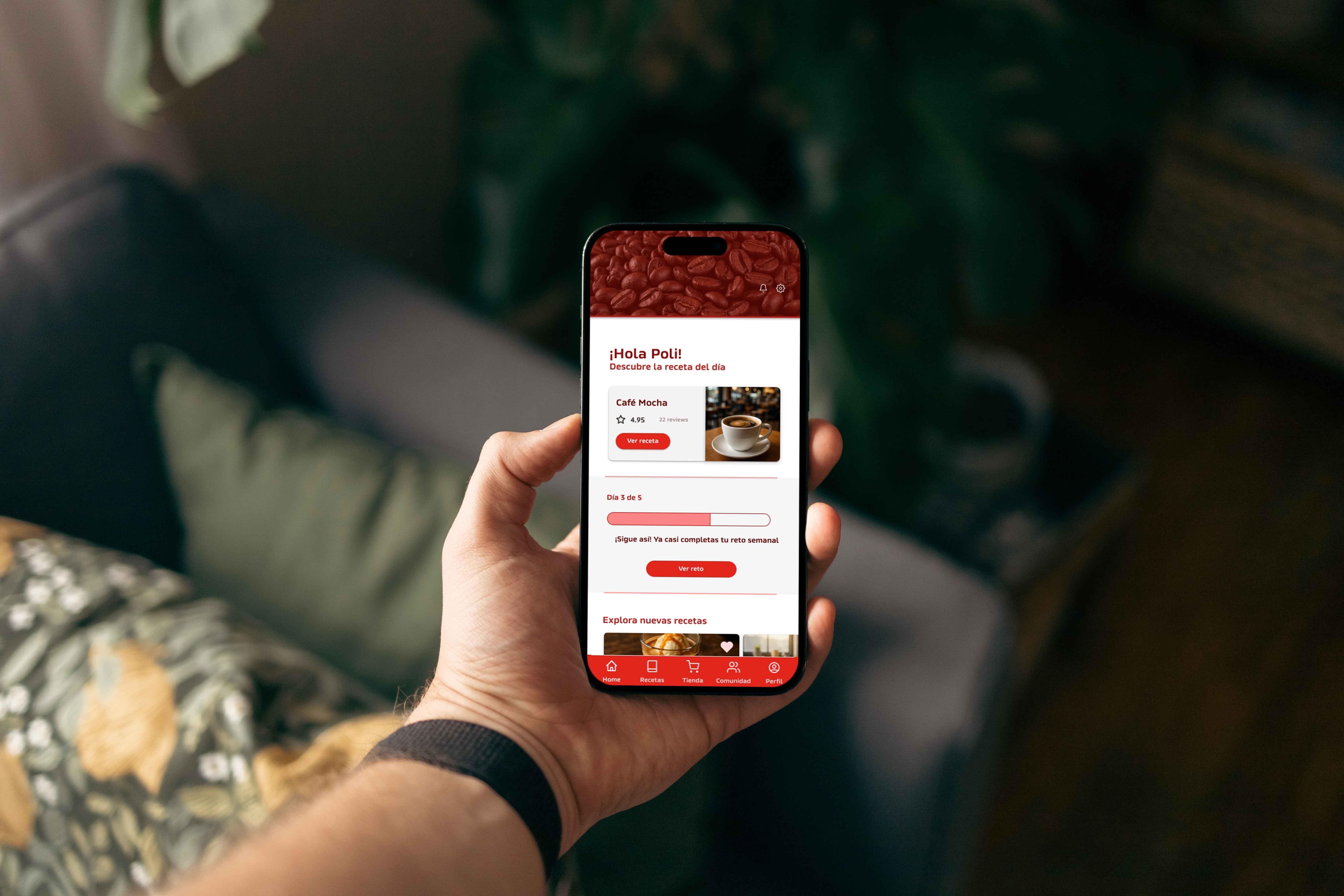
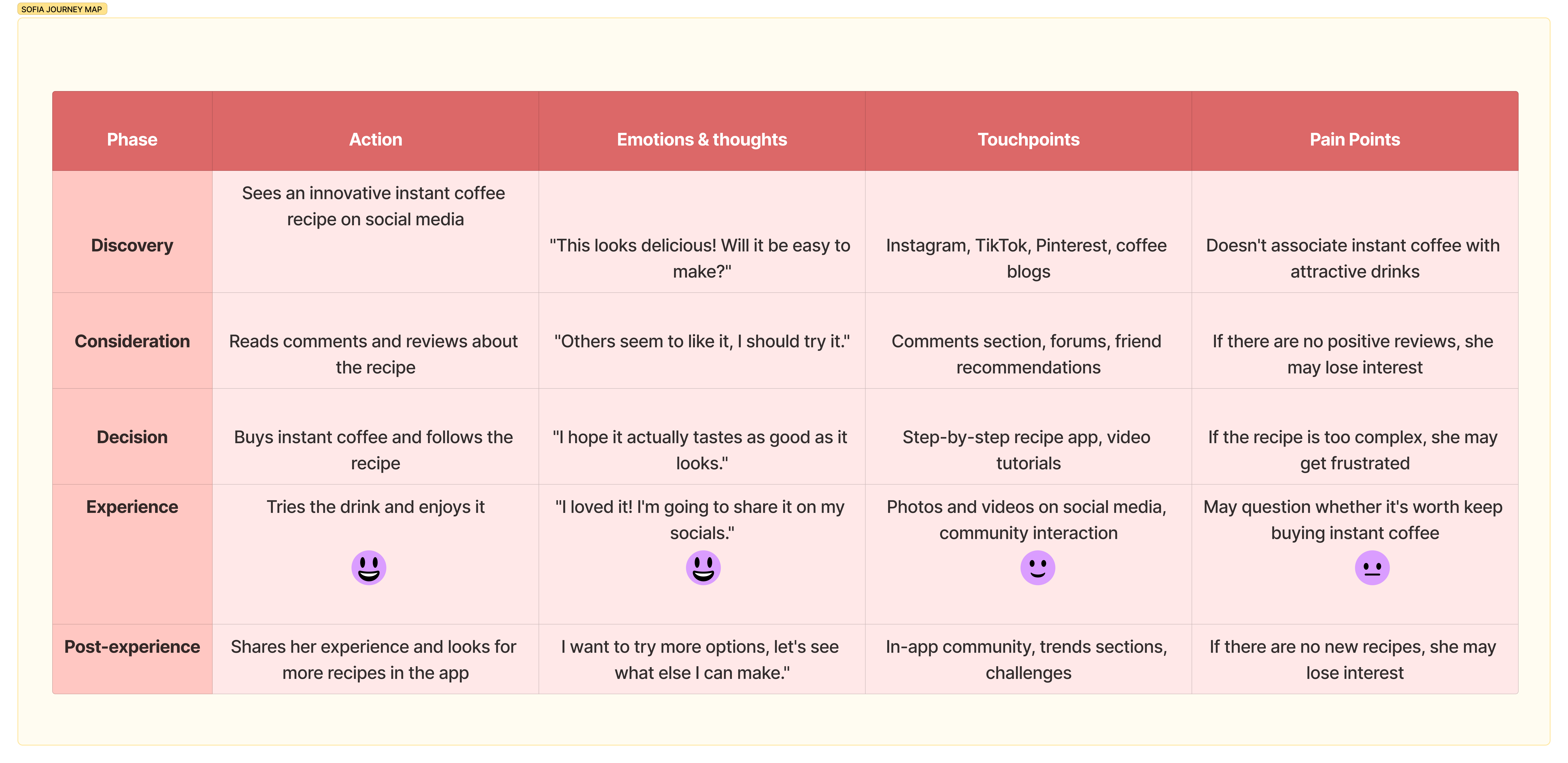
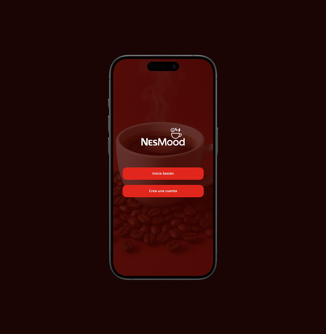
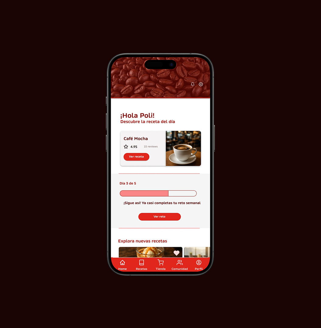
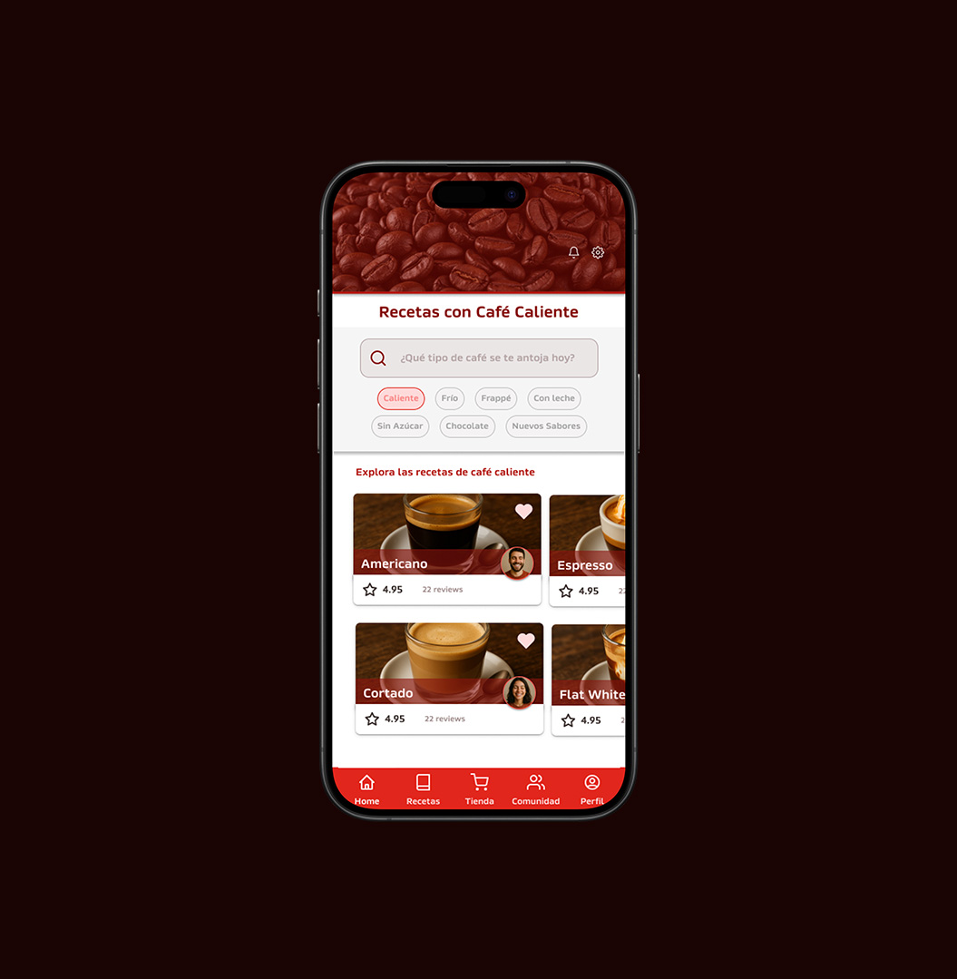
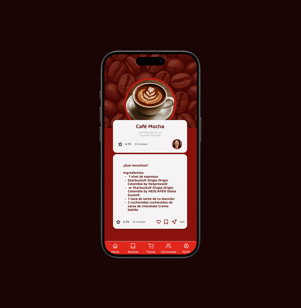
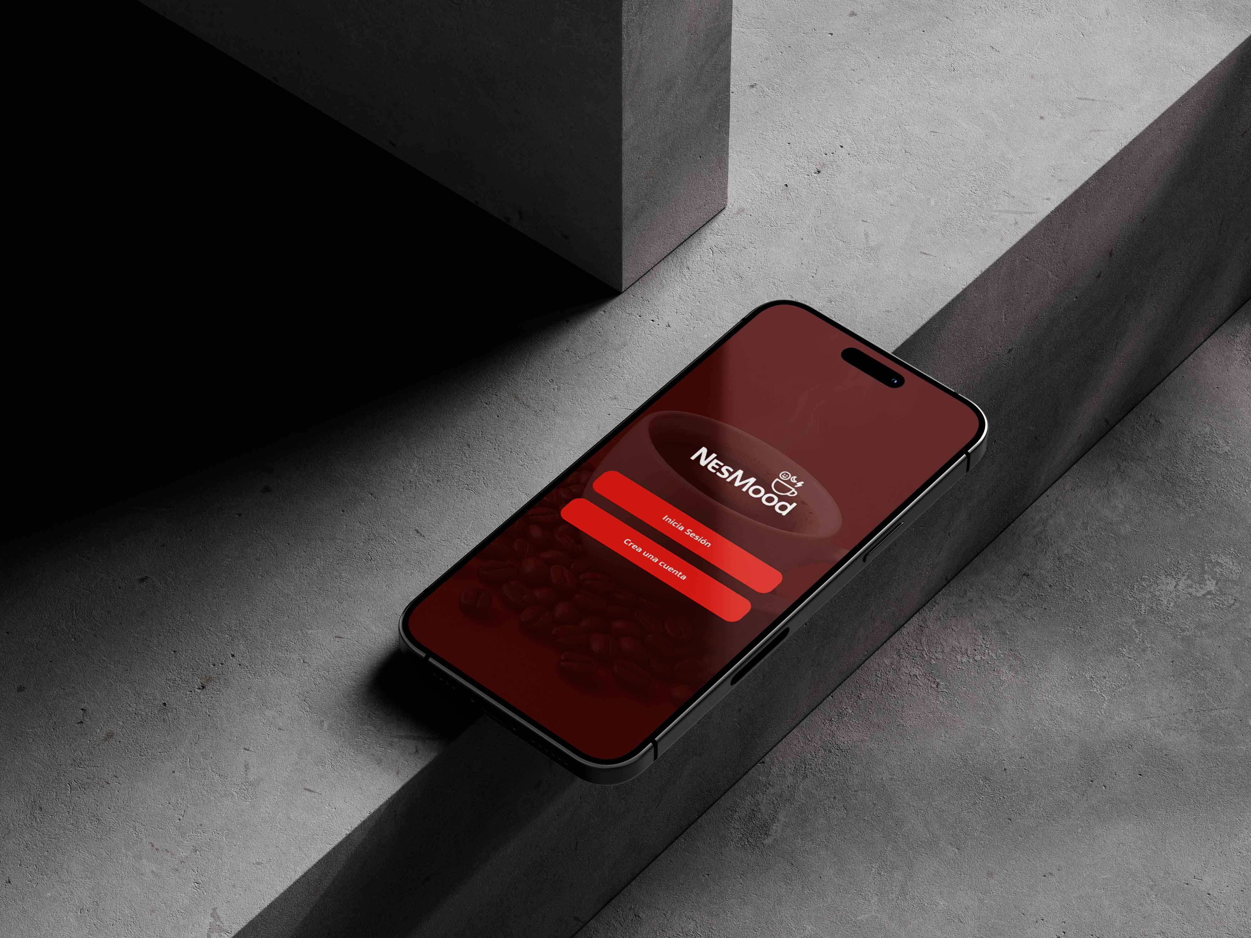
NesMood is a concept app that transforms the coffee experience into something interactive and mood-driven. Built around Nescafé's brand identity, the app connects users' emotional states with personalised recipes, challenges, and a community of coffee lovers.

Through gamification, UX writing, and an intuitive digital ecosystem, NesMood creates a new way to relate with coffee — beyond the cup.

  • Mood-based recipe discovery
  • Weekly challenges & progress tracking
  • Community & social features
  • In-app Nescafé store
NesMood Challenge
02
Business Problem
Benchmark
Pain Points & Needs
72%
of Nescafé consumers have no digital relationship with the brand beyond purchase
85%
of users want personalised content and recommendations based on their mood
68%
are more likely to stay loyal to brands that offer engaging digital experiences

“Coffee is already emotional — the opportunity is to design an experience that meets the user where they are, not just what they drink.”

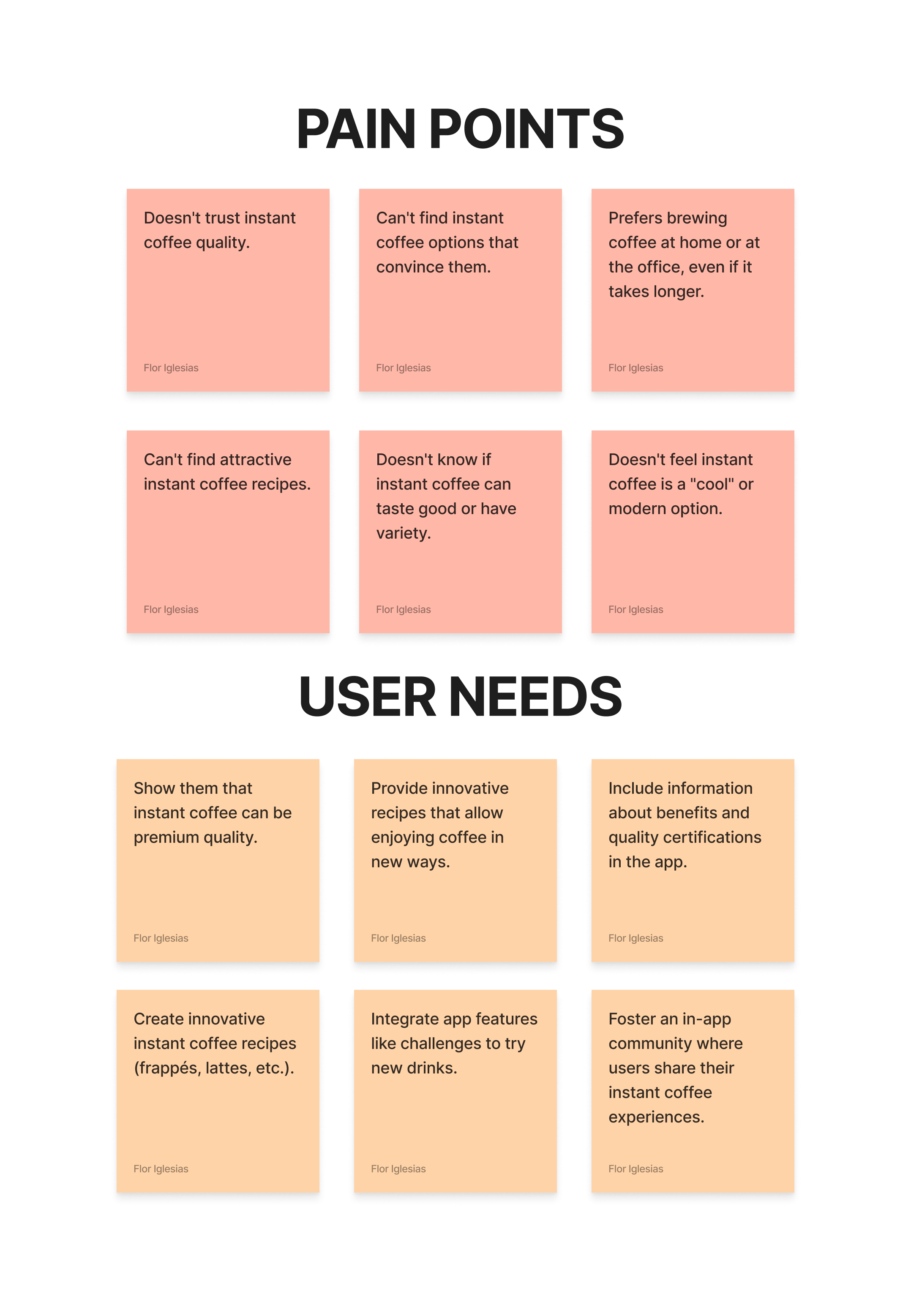
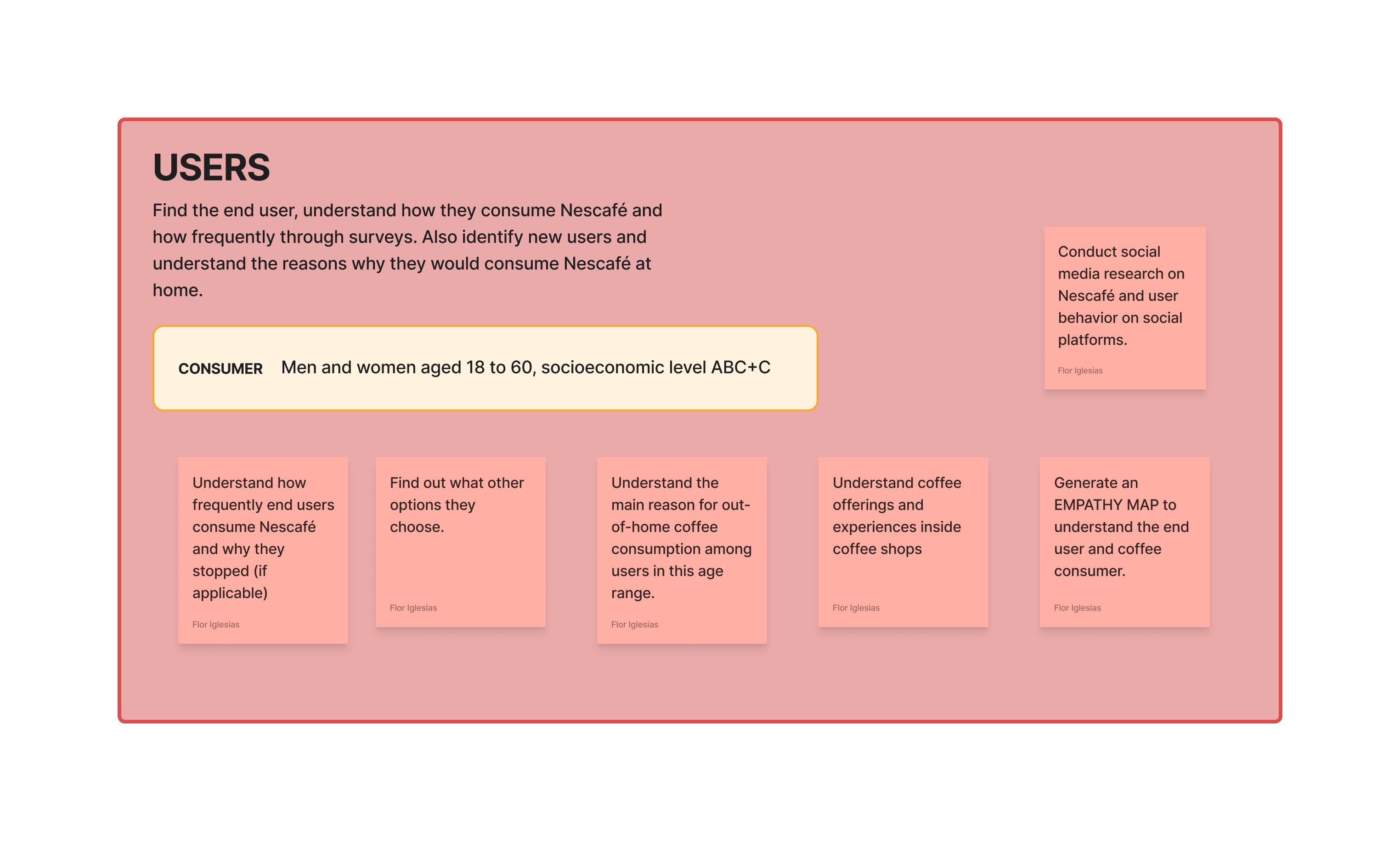
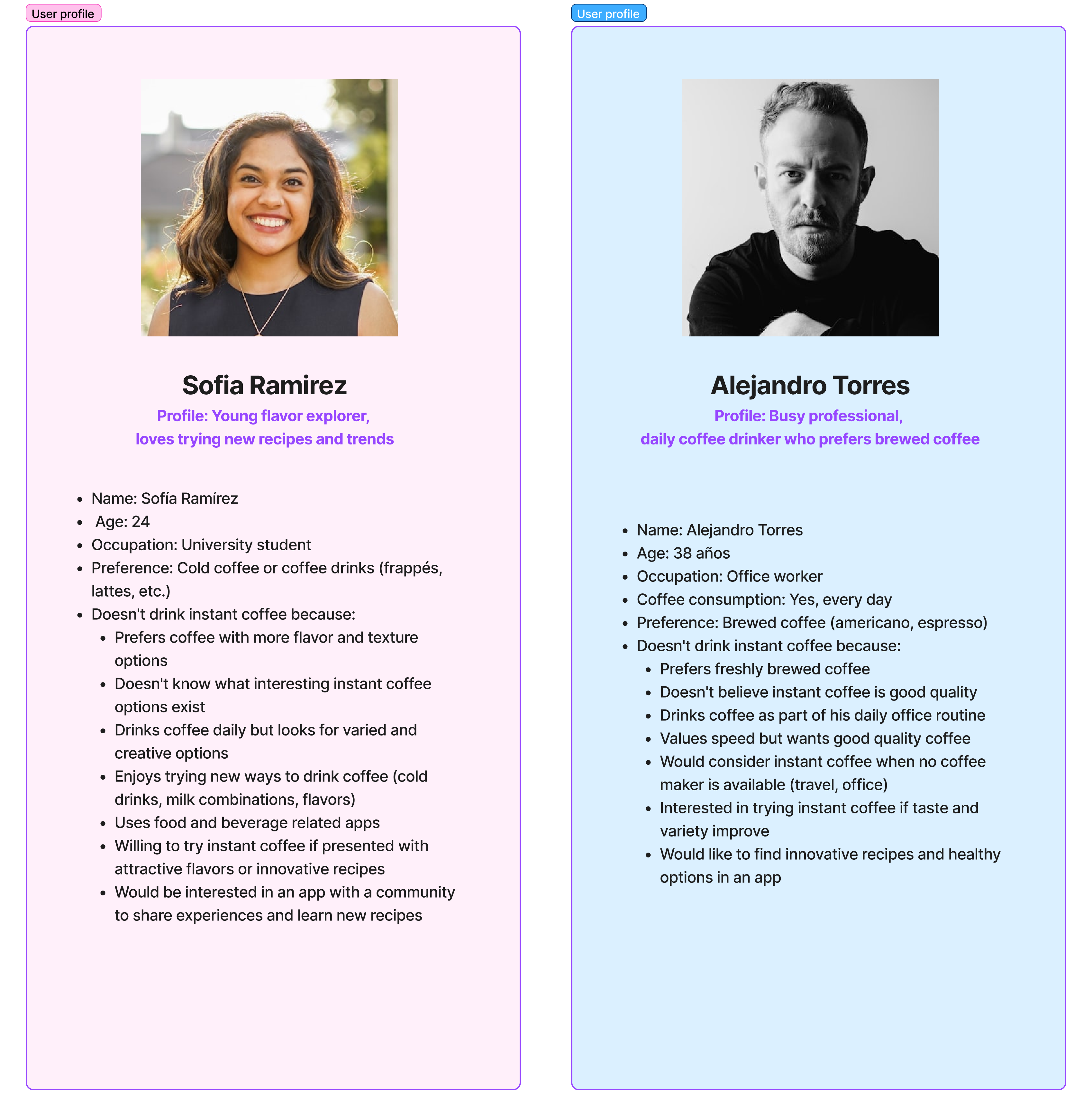
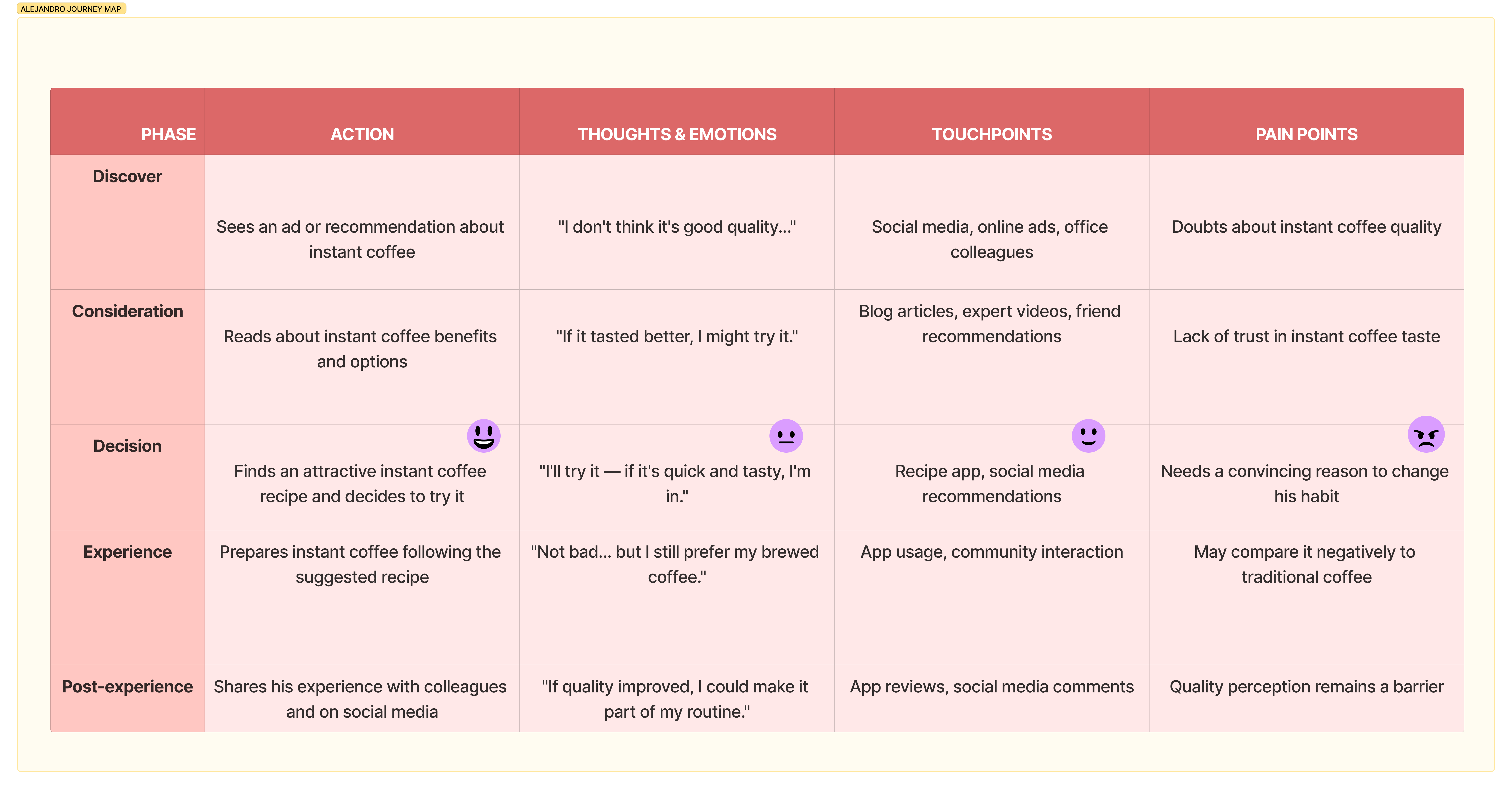
Key insight from user research

03
User Personas
User Personas 2
Journey Map — Alejandro
Journey Map — Sofia
04
SMART Goals
Moscow Method
Wireframes — Low fidelity
Wireframes — Low fidelity 2
05

Visual Language

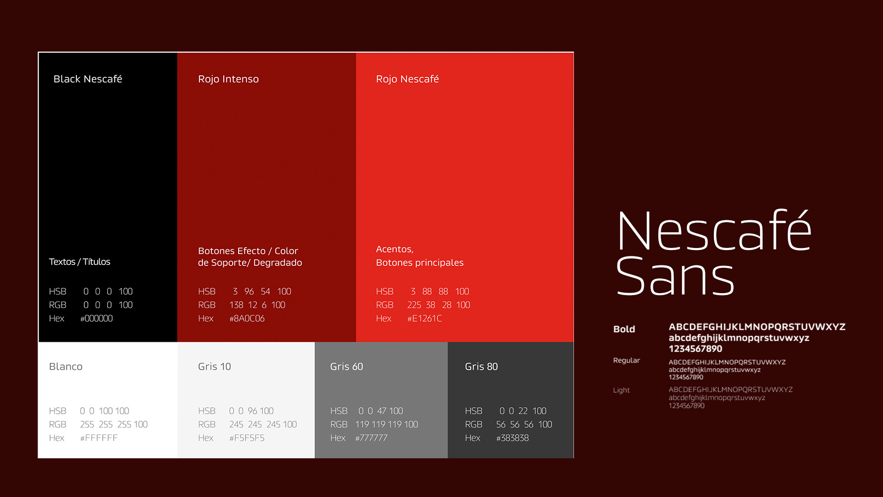
Rooted in Nescafé's iconic brand identity — deep reds, blacks, and warm whites — the design system was built to feel premium, warm, and energising.

  • Primary: Rojo Nescafé (#E1261C) — action & passion
  • Secondary: Rojo Intenso (#8A0C06) — depth & richness
  • Neutral: Black (#000000) & White (#FFFFFF)
  • Typeface: Nescafé Sans — bold, clear, brand-aligned
Design System
06
Pantalla — Inicio / Login
Login
Pantalla — Dashboard
Home
Pantalla — Categorías
Recipes
Pantalla — Receta
Recipe Detail
Pantalla — Favoritos
Favourites
NesMood Mockup
Overview
07

Testing the MVP with real users

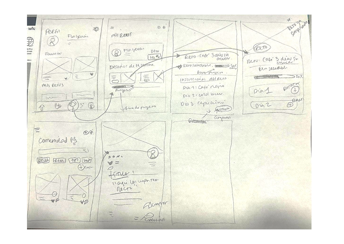
Usability tests were conducted with a navigable prototype using Maze, testing the 4 main MVP flows with real users.

Tool Maze
Participants 4 users
Format Prototype Test — Screen based
Flows tested 4
  • Registration / Login
  • Recipe of the Day
  • Challenge Exploration
  • Community & Store
View navigable prototype in Figma
Results
Flow Success Rate Misclick Rate Avg. Duration
Registration / Login 100% 72.2% 63.9s
Recipe of the Day 100% 85.7% 127.4s
Challenge Exploration 100% 33.3% 23.7s
Community + Store 100% 36–38.5% 43.1s / 17.9s
08

Learnings

Designing within an established brand like Nescafé required balancing strict visual guidelines with fresh UX thinking. The tension between brand fidelity and user needs drove the most interesting design decisions.

  • UX writing tone was critical — warmth without being generic
  • Gamification elements needed to feel organic, not forced
  • Testing revealed users wanted fewer steps to reach recipes

Next Steps

  • Develop the mood-detection onboarding flow
  • Expand the community and social features
  • Test with Nescafé's actual target demographic in Latin America
  • Explore AR filter features tied to coffee moods
← Return to
All Projects
See Also →
WanderHub